
I led the interaction design of a migration journey affecting millions of Microsoft employees worldwide. The challenge wasn’t building new features, it was guiding people away from a familiar tool (MyHub) into a new ecosystem (Viva Connections) in a way that felt guided, not forced.
MyHub was where employees accessed work tools like HR information and common daily tasks. It had routines built into it. Viva Connections was meant to replace it with a hard deprecation deadline.
The question: how do you design a goodbye that people actually trust?
The reality
I had spent my early years at Microsoft shipping features in MyHub, a beloved mobile app created especially for Microsoft employees.
From system application features like notifications to employee experience features like helping employees find and reserve workspaces, book a seat on a Connector shuttle, and increase their productivity with a simple way to clear their work calendar.
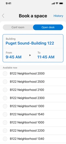
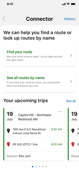
Employees relied on them daily. They knew exactly where to go, knew they’d find what they needed quickly.
That reliability created attachment.

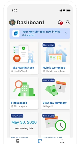
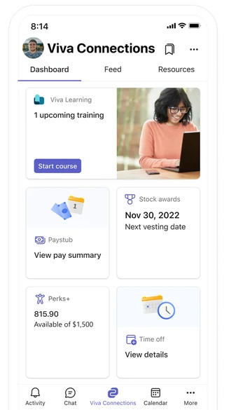
The company decided to deprecate core MyHub features and move them to Viva Connections, Microsoft’s new customer-facing employee experience platform.
After July 31, employees would lose access to these tools in MyHub entirely.
Employees didn’t hear “better platform.” They heard:
“you’re losing something familiar”
Early adoption metrics confirmed it: people were resisting.
They’d built routines around these tools.
Why abandon them for something unfamiliar?
The learning
Past MyHub research revealed something crucial:
“employees experience emotional connection to how we frame moments of change, whether that’s recognizing a milestone or announcing a transition. How you communicate matters as much as what you’re announcing.”
I used this research insight to develop a principle:
Messaging shouldn’t be intrusive by default. Intrusion should be proportional to rarity and urgency of the message.
Below are samples of my feature work applying this principle.
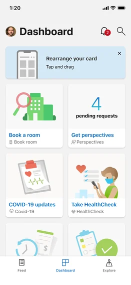

Quick tips message bar.
Use for education on all system applied features.
contextual
card alert
The strategy
Working with content design, I set intrusion rules for each message type:
when it appeared, how often, what it could say, and what action it asked for.
I owned the interaction strategy and visual design.
The migration moved through four stages. Each one changed where the message sat and how hard it pushed, from a quiet banner on the Dashboard to a full-screen takeover once the features were gone.
Dashboard
Viva needed to feel like an upgrade, not a replacement. The banner stays quiet, and the sheet gives one low-pressure path into Viva.
Feature notification
Viva Connections was still new, and the migration depended on conditions we didn’t control, such as the accessibility review.
As users got used to the banner, we needed a more intrusive reminder during this waiting time. Notifications reuse an existing pattern, so they were low-cost to build and quick to ship. They also let us update the copy as each dependency cleared, without redesigning the dashboard. This way internal communication to adopt Viva Connections never stopped.
Right when users open MyHub + dashboard
The takeover made the timeline hard to skip, and the copy shifted from exploring to planning the move. The persistent cards then kept the path to Viva visible after the sheet was dismissed.
Right when users open MyHub showing only once + dashboard
Once core features were retired from MyHub, the job was to help people find what had moved.
The takeover message runs once so it doesn’t become noise for people who have already seen it. The banner stays because people will keep looking for HR tools in MyHub out of habit, and it sends them to Viva without another interruption.
+20% conversion lift from the MyHub to Viva Connections migration messaging.
The notification patterns moved employees onto Viva Connections, and overall engagement roughly doubled through the transition.
“Nanda does an incredible job of integrating into engineering teams and practicing Agile methodologies in a team setting. During the MyHub user migration project, she displayed the ability to work in an environment that requires the flexible reassessment of plans that are carried out in short, iterative phases of work and to work across phases non-sequentially, as needed.”
“One rare quality you have is that you combine radical openness and collaboration with the ability to keep pushing projects forward”