





Constraints as opportunity
Adaptive Cards’ limits forced systematic thinking. Working inside them, not against them, created a more resilient system.
About the project
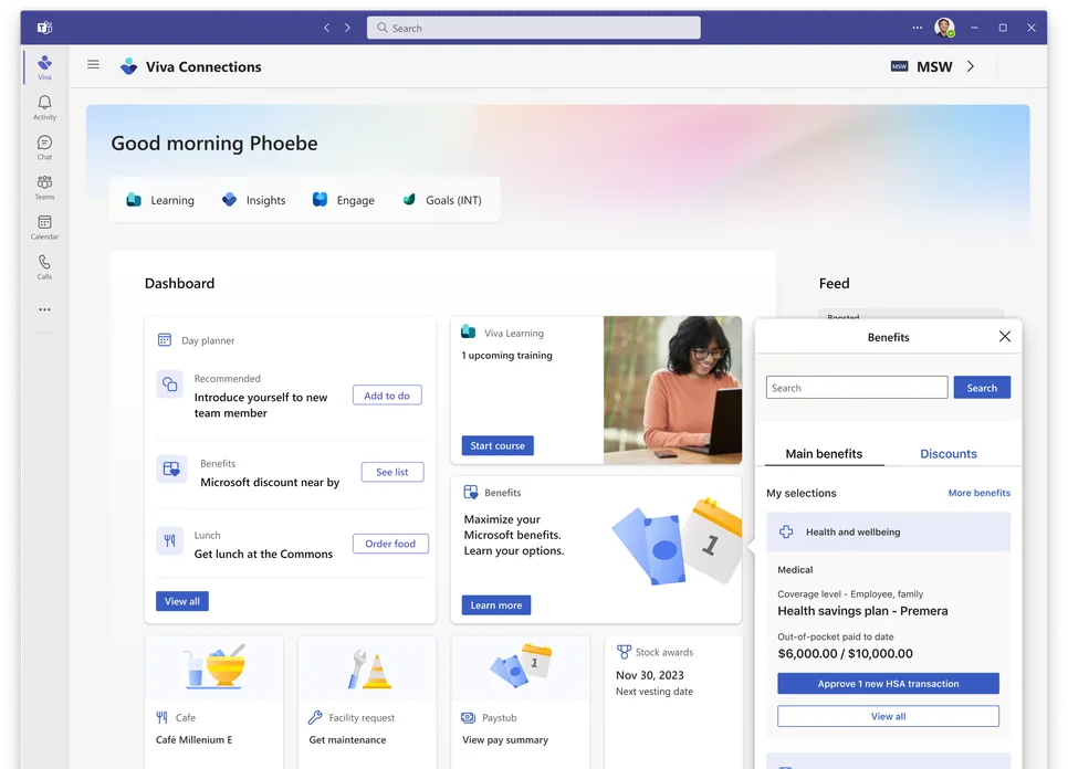
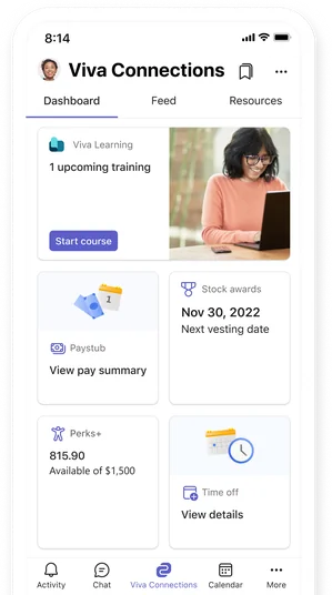
Viva Connections is where Microsoft employees go for company information, HR help, and IT support. When Microsoft transitioned its employee experiences to Viva, we had to rebuild them from scratch using Adaptive Cards, a UI framework with a limited set of components.
The challenge was simple: Adaptive Cards didn’t have all the components we needed. We had to build the rest.
Co-leading the initiative with two other designers, I owned 7–10 components end-to-end, contributing to a UI pattern library of 20+ components. This toolkit is adopted by teams building experiences in Viva Connections across Microsoft.
The toolkit story is told in Microsoft’s Inside Track, but the principle applies to any design system or platform.

The reality
During initial audits, we found 40+ common UX patterns across major employee experience tools. Adaptive Cards supported only 12.
That gap meant every team rebuilding for Viva Connections faced the same problem: invent workarounds or wait.
The constraint wasn’t just technical. We had to migrate the entire MyHub experience to Viva Connections. Multiple teams, multiple experiences, all on a fixed timeline.
Delays here meant delays for all Microsoft employees waiting to access their work tools in Viva. Each team couldn’t solve the pattern gap independently—we needed a shared system fast without sacrificing consistency or quality.
The strategy
I chose to work inside Adaptive Cards’ constraints instead of fighting them. We layered new patterns by combining what already existed in Adaptive Cards’ native atoms. That kept the system maintainable at scale.
Every pattern began with analysis: where does this exist in MyHub, what’s essential? Only then did I rebuild using Adaptive Cards’ atoms.




Text

Surface

Need different color surface
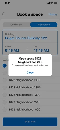
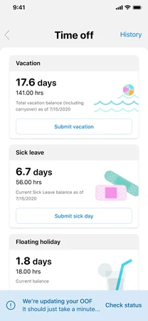

Layer on top of current page
Layering simple primitives systematically to create patterns that worked at scale, from component level to how it flows within the full experience.
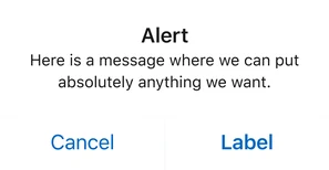
Modal & message bar: With Adaptive Cards’ Atoms
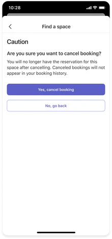
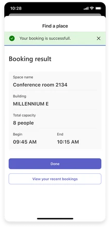

I realized static Figma mockups and documentation weren’t enough. Designers and feature owners needed to see and interact with components in real Viva Connections context before they’d confidently adopt them.
I proposed a live sandbox demo in Ring 0 so teams could test components in real context before adopting. I also organized the design syncs and technical grooming cadence that let both sides of the work move in parallel.
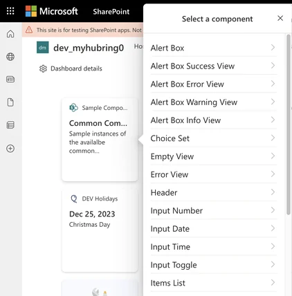
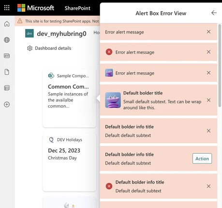
The governance process
A pattern designed in isolation is just a hypothesis.
Every component went through two validation loops in parallel.
Each of us owned specific components end-to-end. Both design and technical validation happened in parallel; only once a pattern survived both did we document it completely.
That parallel structure, the documentation discipline, and the live sandbox demo became the scaffolding that let feature crews across Microsoft adopt with confidence.
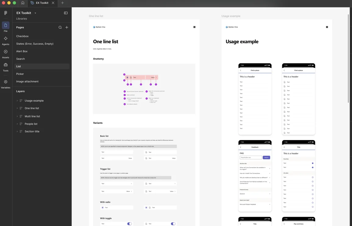
The EX Toolkit became the shared system designers, engineers, and feature owners use to build Viva Connections experiences faster and more cohesive. I owned 7–10 components that shipped as part of this toolkit.
20+ components · 800+ variants
Built across three co-lead designers and documented for teams across Microsoft.
2,000+ downloads in 6 months
90+ weekly downloads across teams in Microsoft (internal experience owners, Viva Connections product team and Microsoft Education team).
20+ experiences shipped
Multiple teams moved faster using the toolkit as foundation.
These metrics reflect Microsoft adoption of EX Toolkit within Microsoft’s Viva Connections ecosystem.
“Your work on the toolkit empowered our team with a set of consistent, reusable components. I’ve seen the impact both in the efficiency of our delivery timelines and in the outcomes: improvements in how cohesive, consistent, and high-quality the experiences we deliver are across the team.”
“Nanda is always thinking about how to help people do more across the team, as evidenced by her continued work on the adaptive card toolkit, which is becoming an essential resource for both Studio folk and beyond.”
Adaptive Cards’ limits forced systematic thinking. Working inside them, not against them, created a more resilient system.
Documentation, governance, and interactive demos aren’t overhead. They’re what let teams adopt with confidence.
The toolkit’s impact came from creating space for others to build on it. Systems scale when you enable contribution, not just consumption.